RichLyn: Rich in Art
Did you know where the art in the RichLyn Library came from? Well, much of it is actually the work of HU students and alumni. Each year, the Robert E. Wilson Art Gallery holds the Juried Student Art Exhibit. Then, the Library staff chooses one exhibit to bring in as part of their personal collection. That said, why not take a tour of the pieces displayed as of 2026?
Starting from 2009 is Benjamin Hopper’s photograph, “The L.” This is a two-point image taken from the corner (hence “The L”) across from the Illinois Institute of Art building. The color palette is blue-toned monochromatic. A second glance reveals that “The L” is actually multiple photos of the same place, seemingly taken from slightly different angles and at different times of day. The blended angles in particular give the central building a slightly curved look. “The L” is on the main level and hangs over an area designed for conversation.
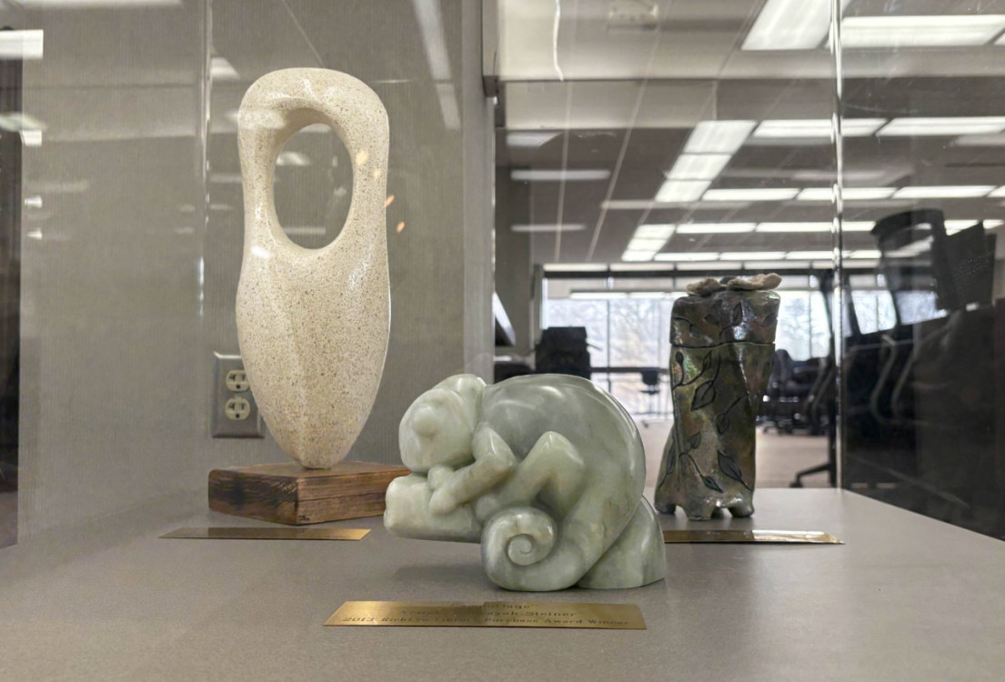
In 2010 came Juan Lopez’s “The Stone.” The sculpture is oblong, tapers inward at the base, and has a large round hole in the upper half. This shape almost resembles a navigation marker. “The Stone” seems to blend a geometric idea with the natural look of softened edges that flow across the glossy surface.
In 2013, “Camouflage” emerged from the hands of Sherayah Steiner. “Camouflage” is a sculpture of a chameleon on a branch. The chameleon’s shape is remarkably smooth, visually comparable to soap. The material Steiner used is hard to identify; it looks like jade or, more likely, light green marble.
In 2019, Megan Duckworth produced her ceramic work, “Twisted Flower.” A four-sided pedestal, segmented near the top, twists vertically. Its body dons a metallic iridescence and engravings of leaves which wrap around the edges. From the top sprouts a white flower.
A few years have been skipped because the last three artworks are displayed together. They commune while facing the librarians.
Returning to chronological order, 2011 brought Rachel McCoy’s “Ugly Duckling.” This graphic comprises three storybook-esque illustrations retelling the story of the same name. Color is used to reinforce the narrative with the red hues to represent the ducks and their environment while blue represents that of the swans. “Ugly Duckling” is on the lower level, where most sun is let in.
In 2012, the Library adopted Hannah Hochstetler’s painting, “Krishna.” The piece shows a young boy with his hands over his face. His palms face outward, giving off a playful or mysterious impression. This could be the case as Krishna is a major god of the Hindu pantheon who is known for his adventures and playful characterization. Hochstetler’s painting could easily be mistaken for a photo due to her realistic attention to detail, use of sepia hues, and remarkable emulation of a blurred background and lens flare. “Krishna” is on the main level, hanging outside the office of the director of library services.
Hochstetler returned in 2014 with “Alice in Wonderland.” This is a series of photos depicting a girl interacting with familiar items and set pieces from the classic tale. They look to have been shot between the afternoon and golden hour, giving each image strong warmth in their natural lighting. “Alice in Wonderland” has its own alcove for display on the lower level.
In 2015, Erdal Kulgu made “Lazarus,” a graphic retelling of the parable “The Rich Man and Lazarus.” Kulgu’s work looks like it could have been from the Middle Ages. The paper itself sports an aged texture. Each illustration is accompanied by narration in an Old English typeface, inspired from that era. The artwork uses thick lines and subtle shading, and the characters are simultaneously stylized and realistic. “Lazarus” is likely a graphite piece, although charcoal could have been used as well. “Lazarus” is on the main level, obscured next to an open space.
Made in 2017 was “Industrial Meltdown” by Troy Hester. This is an abstract painting of geometric shapes using a gritty brown space occupied by matte, primary-colored objects with precise edges. The contrast in textures causes the matte objects to look as if they do not belong. The background seems to be claiming back its space as black paint drips down from the top, hence the meltdown. “Industrial Meltdown” is on the lower level on the way to a quiet area.
2018 welcomed “Transitioning” by Jason Mitten. Jason painted with explosive colors that work in chaotic harmony. The background is made up of thick, short brush strokes, producing a patchwork-like effect. This pattern helps the hummingbird and flower stand out in the foreground with thin, long streaks of color that emphasize motion alongside the motion blur of the bird’s wings. “Transitioning” is on the main level, sitting and chatting with the bulletin board.
In 2020, Brody Bowman drew “Majesty.” This is a charcoal piece with a lion’s face taking up the frame. Bowman’s attention to detail on the fur is astounding, especially where the skin folds around the whiskers and forehead. His linework creates a texture that breathes life into the piece. “Majesty” is on the main level and oversees where most people pass between floors.
In 2021, Carmen Tier debuted her “Flower Series.” This is a collection of three square still-lifes done with colored pencils. From left to right, the flowers are likely to be a magenta lilium cernuum, a pink Peruvian lily, and a purple iris (the specific type is difficult to identify). Together, these flowers seem to represent a union of congruity and variety. While all three flowers have six petals and two of them are lilies, each has a distinct silhouette. Tier’s use of pink, magenta, and purple creates an analogous color palette. Each flower even has its own marking; speckles on the lilium cernuum, dashes on the Peruvian lily, and zebra stripes on the Iris. The “Flower Series” is on the main level by an instrument for precise cutting.
“Wind” blew into 2022 from the lens of Jin Zou. This is a photo of some species of tall grass bending in the wind. Zou likely shot this in autumn due to the dried, yellowish color of the plants. Wind can be a symbol of change, and autumn is a season of change, so this could have been intentional. “Wind” was shot close to the ground, letting the sun highlight the shadowed bodies of the grass and weeds. “Wind” blows on the upper level, bending away from a window and toward the squirrels.
In 2023, Solomon Rangel painted “Teapot Still Life.” A copper teapot sits on a wooden surface on a blue cloth. A few garden crops sit by the pot. Rangel used various shades of complimentary colors — orange and blue — to create a scene that is simultaneously earthy and vibrant. His brushwork evokes a strong texture that lets the scene be felt without touch. “Teapot Still Life” lives on the lower level by an office for honorary titles.
In 2024, Elizabeth Kruse assembled her “Majestic Bird,” a found object sculpture. “Majestic Bird” is a peacock made of metal objects standing proudly on a chunk of wood. The eye is a washer surrounded by feathers of pull tabs from cans. Twisted wires with beads on the ends form the crest. Spoons, spatulas, keys, beads, wires, and forks with their prongs curved outward flow together to form the tail. “Majestic Bird” stands on the main level between a dictionary and an atlas.
Lastly is “Art of a Squirrel” by Kaylee Dyman. This is a mixed media piece of six squares depicting a squirrel, each in a different style. The first is a black background with white lines forming abstract and intricate patterns which make up the squirrel’s body. Second is a squirrel’s face surrounded by warm hues that mingle with its gray fur. Third is a squirrel that looks to have been painstakingly made through the stippling technique. Fourth is a squirrel on a branch drawn in a more cartoony style reminiscent of a story book illustration. Fifth is a squirrel drawn with the scumbling technique. Sixth is a squirrel made of solid abstract shapes with floral patterns on and around it. “Art of a Squirrel” stays on the upper level, adding color to a quiet corner.
I’ve neglected to include photos of most of the exhibits because I want to give as many people as possible a reason to go to the RichLyn Library so they can appreciate the art for themselves. There is a lot of art, history, and helpful resources to be found at the Library, so check it out!